The 'Offers Overview' template provides a variety of widgets specifically designed to individually present your categories and their associated offers. Whether you prefer a tabular overview, require a calendar for time-bound offers, or wish to visually enhance your courses using tiles, the 'Offers Overview' template offers the appropriate widget for every need.
In addition to versatile display options, our template also includes widgets for filtering offers, enabling users to specifically search for courses relevant to them. This documentation guides you through the diverse functionalities of the 'Offers Overview' template and demonstrates how to effectively utilize them to optimally present your offers.
Available Widgets in the Offers Overview
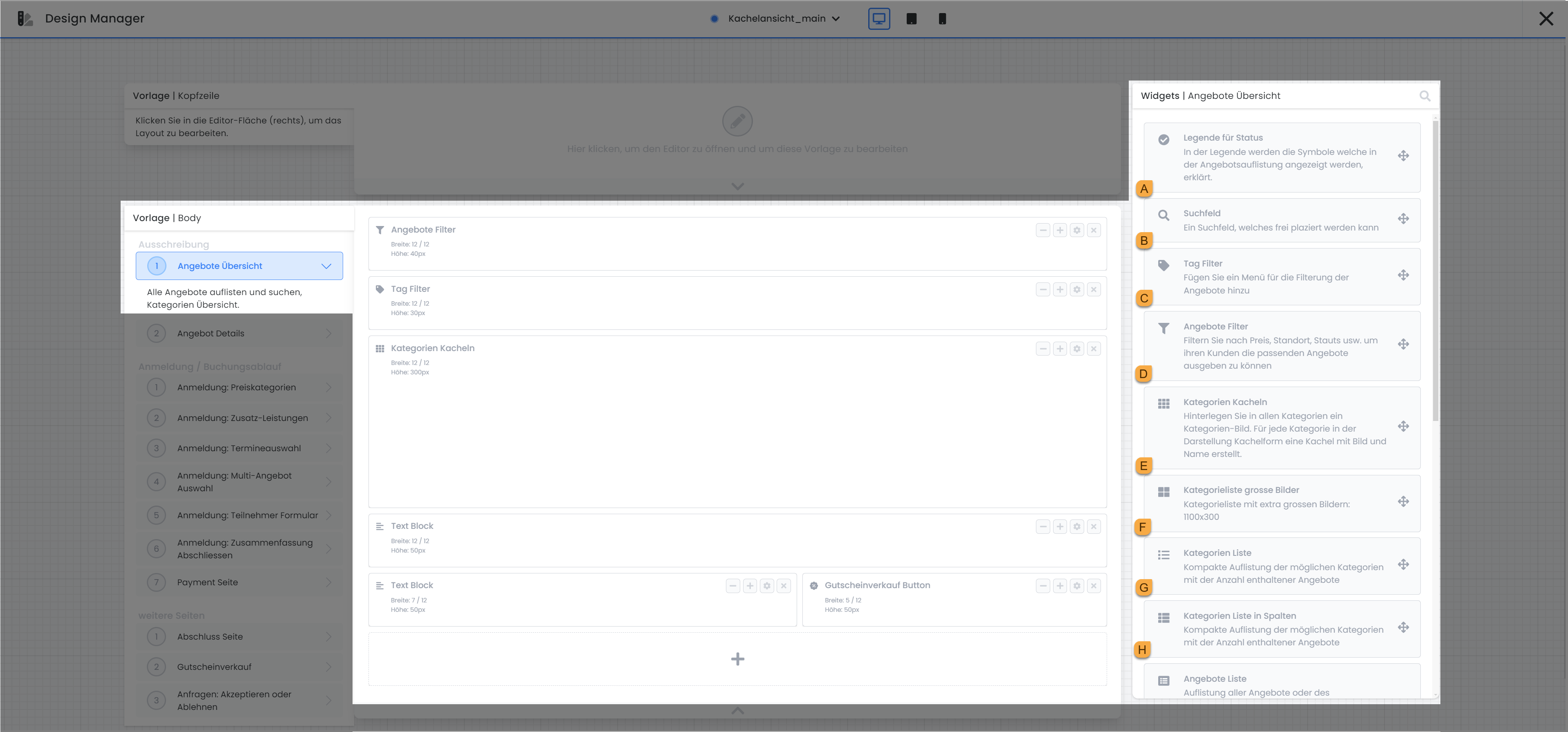
Key to statuses A
The Legend for Status widget explains the meaning of the various symbols that indicate the status of an offer. You have the option to individually customize the text describing the meaning of a status. In the preview, a specific status is only displayed if it appears in at least one of the offers.
Search box b
The Search Field allows users to search for an offer by name. The widget is limited to the standard settings generally available for widgets and does not offer any additional specific configuration options.
Tag Filter c
The Tag Filter enables advanced navigation in addition to the existing category structure. With Tag Filters, you can determine which filters your customers can use to filter for specific offers in the offer overview. A prerequisite for this is that you have already used tags in your offers. Furthermore, it is possible to add multiple tags to a single Tag Filter. When this Tag Filter is applied in the preview, filtering occurs based on all included tags. The precise application of this function is explained in this documentation.
Filter offers d
With the Offer Filter, you provide your customers with the ability to find precisely the offers that meet their requirements through targeted filtering. The following filter options are available and can be utilized as needed: Price, Date, Instructor(s), Location, Search, Category, Tag Filter, and Status.
For the Instructor(s) and Location filters, you can define which instructors and locations should be available for filtering. The Category filter automatically displays all existing categories from your edoobox account. The Tag Filter functions identically to the separate Tag Filter widget, allowing customers to search for an offer using specific tags.
Optionally, in the widget settings for Price, Instructor(s), Location, Status, Category, and Tag Filter, you can specify that only values from the filtered set are displayed for selection. This setting must be activated individually for each filter option. For the Tag Filter, the potentially occurring tags must be added to the widget beforehand.
Categories Tiles e
The Category Tiles present your categories in an appealing tile view. If you have added a suitable image to a category, it will be displayed in an enlarged view.
-
Categories that do not contain published offers can be hidden to maintain a clear overview.
-
By clicking on a category or the “Display” button, the offers contained within that category are made visible. Optionally, the “Display” button can be hidden to further simplify the design. Do not forget to add a widget that displays the offers (for example, the Offer Table widget).
Tip: Tile Design
Add the Offer Table widget in another design to ensure that offers are displayed when a tile is clicked and the view transitions to a deeper level.
Currently, only the guide for Version 1 is available. Guide: Setting up Tile View in the Design Manager
Category list: large images f
With the Category List Large Images, images are placed across the entire width of the widget, similar to a banner. The category name is displayed below the respective category image. Categories that do not contain published offers can be hidden to maintain a clear overview.
List of Categories g
In the Category List, all categories are displayed one below another in a list view.
-
Categories that do not contain published offers can be hidden to maintain a clear overview.
-
You have the option to choose whether categories should always be visible or if they should be expandable within a dropdown menu.
List of categories in columns h
In the Category List in Columns, categories are listed side-by-side in multiple columns.
-
The title “Our Categories” can be customized.
-
The number of columns and rows can be manually adjusted.
-
The background color can be changed in the widget settings.
-
Categories that do not contain published offers can be hidden to maintain a clear overview.
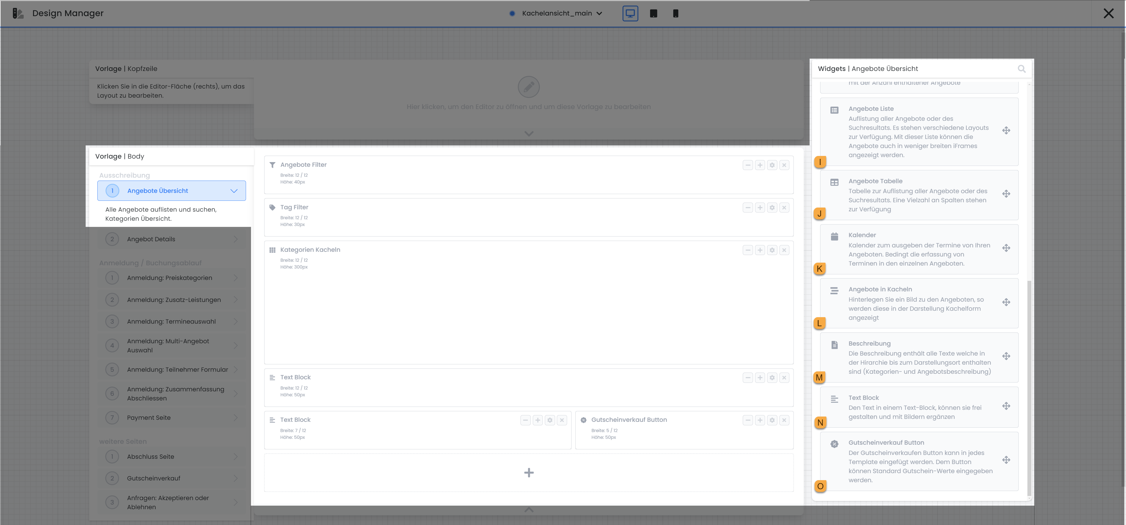
List of Offers i
If you add a suitable image to an offer, it will be displayed in an enlarged view within the Offer List. The Offer List is fully responsive and automatically adapts to the respective output device to ensure optimal display across various screen sizes.
-
Rows such as Number, Date, Location, Available Slots, Instructor(s), Start Date, Time, or Lessons|Modules Overview of an offer, can be manually selected for display.
-
You have the option to display either an image of the offer or the first ten already registered participants.
-
All links can be opened in a higher frame → if a visitor opens a link within your iFrame, they will see the Standard View of your offers.
-
If multiple pricing tiers are available, a price range from a minimum to a maximum value (FROM - TO) will be displayed. Alternatively, you can opt to show only the standard price of an offering.
-
Button: Register Now: The registration button, positioned to the right of the offerings, can be displayed or hidden as required. Furthermore, the button's default text, 'Register Now', can be customized. If an offering is in a 'Waiting List' status, the button text automatically changes to 'Waiting List'; this text can also be renamed if desired.
-
Button: Details: The 'Details' button, also located to the right of the offerings, can be toggled visible or hidden as needed. Additionally, the button's default text, 'Read More', can be customized. Clicking this button redirects the user to the 'Offer Details' page, which provides a comprehensive description of the offering.
-
The banner for various statuses can be enabled or disabled, and its associated text and label color can be modified.
Special Offers Table j
All offerings are presented in a tabular format within the Offer Table.
-
Columns such as offer name, status, date, price, and others can be independently selected.
-
Tags containing values can be added as supplementary columns; further details can be found here → Using Tags with Values
-
The description can be permanently displayed in a truncated version of up to 250 characters, or it can be configured to expand upon user interaction (click).
-
It can be enabled such that every link click for an offering directs to its details page. This means that even clicking 'Register Now' will first navigate to the offering's details when this setting is active.
-
The 'Details', 'Register Now', and 'Book Now' buttons can each be individually toggled visible or hidden.
-
All links can be opened in a higher frame. If a visitor opens a link within your iFrame, they will be presented with the standard view of your offerings.
-
Offerings can be categorized by their execution months, with the months displayed as section titles.
-
The offer name can be hyperlinked, allowing users to navigate directly to the corresponding details upon clicking the name.
-
The table can be displayed responsively on devices with a screen width under 800px, or it can maintain its original size.
Calendar k
In the Calendar View, offerings are presented within a calendar interface.
-
Weekend days can be hidden within the widget's settings.
-
Available slots per appointment can be optionally displayed.
-
The desired time range for display can be manually configured (from – to).
-
Do your appointments consistently start at the same time? Within the widget settings, you can define a specific time for the calendar to scroll to upon its initial display.
-
The time grid interval can be set in minute increments, ranging from 1 to 30 minutes.
-
You can independently select the display format for appointments (Month, Week, Day, or List View) and set the default option.
Offers in tiles l
The Offerings in Tiles display is similar to the Category Tiles presentation; however, this option allows participants to register directly for a course via the tile.
-
The tile width can be defined differently for the standard desktop view and the tablet view.
-
A portion of the description (if available) can be displayed within the tile.
Description m
Do you have a category where the same description needs to be stored for every offer? Instead of adding the Description widget to each offer, add it to the category, and then include the Description widget in your standard design's Offer Overview Template or Offer Detail Template.
Text Block n
Use the Text Block to insert text and images at any point in all active system languages. Choose whether the Text Block should always be displayed, or only when the offer overview is opened within the iFrame itself.
"Buy Gift Cards" button o
When clicking the Voucher Sales Button, the visitor is redirected to the voucher sales page, where they can purchase any voucher from you via edoobox. This page can be found and edited in the Design Manager under Template | Body within Additional Pages. The following settings are available in the Voucher Sales Button widget settings:
-
The button text "Buy Voucher Now" can be customized independently by you.
-
The button color can also be selected from a predefined list of colors.
-
You define the value of the vouchers available for purchase. The option for the booking person to define a custom value is not available.
-
You select which price is pre-selected when the booking person clicks the button.
-
The currency is set by default to the currency stored in your account but can also be individually adjusted.
-
For the "Type of Settlement" setting, you have two options. Choose "Reduction of Offer Price" if you do not want the voucher to be redeemable for additional services, for example. If this is not a concern for you, select the "Settlement with Booking Total" option.
-
In addition to the already available voucher values, the price categories of an offer can be made available for selection if the booking person clicks the Voucher Sales Button on the Offer Detail page.
Marker Map P
Markermap is an interactive map feature in Design Manager that displays locations on a Google Map and is directly linked to the listings. When you click on a marker, the map zooms in on that location and the table is automatically updated with the corresponding entries.
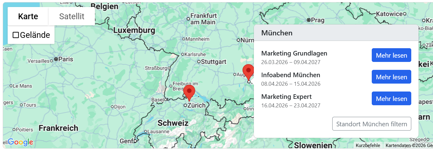
You can customize the map in the Design Manager under Widget Settings.
-
You can set the zoom level for the initial view as well as the map type, such as the classic road map view.
-
A separate Google Maps API key is required for operation. The key is created in the Google Cloud Console and stored in the widget settings.
-
The map design can be created and customized using a Maps ID by creating a custom map style in Google Cloud and saving it in the element. You can define colors for backgrounds, roads, and points of interest to align with your corporate design or highlight specific elements.
-
The text on the "Read more" button can be customized in the settings.
Related Guides
Keywords for this guide
Tag Filter ¦ Design Manager ¦ Offer Overview ¦ Calendar View ¦ Tile View