The Offer Details Template contains all necessary widgets to individually display the details of your offers. Use the Description widget to show the description stored in the offer. If your offer includes individual lessons or modules, it is recommended to add the "Lessons/Modules Overview" widget to the template. For detailed information such as offer number, available slots, location, instructor, or registration deadline, the Offer Details widget is suitable. This widget is particularly useful for presenting all relevant data clearly and accessibly. Below you will find all available widgets within the Offer Details Template.
Available Widgets in Offer Details
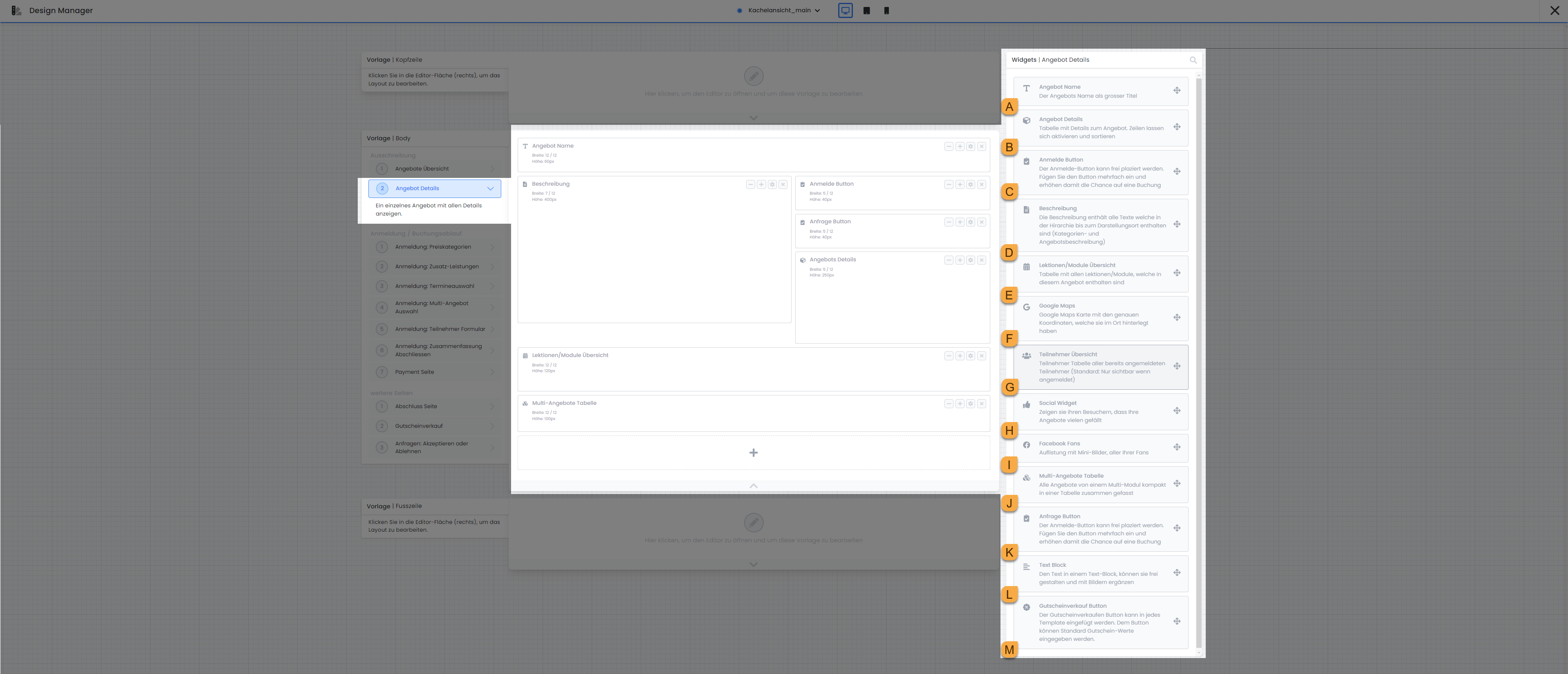
Offer Name A
The Offer Name widget allows the display of an offer's name in various font sizes. You can choose between normal text size, Heading 3, Heading 2, and Heading 1.
Offer Details b
Within the Offer Details, you can specify which particular information about the offer should be displayed, such as its name, ID, available slots, date, location, price, and contact details. Additionally, you can define a specific day's value in an extra row to emphasize crucial information or unique characteristics, such as the offer's language. For more information on using tags with values, please refer to the following documentation: Using Tags with Values
Sign Up Button c
The Registration Button directs participants straight to the registration form, enabling them to sign up for the respective offer. You have the option to customize the button text 'Register Now' and choose from various predefined colors to signify the button's current status. If you have enabled the waiting list for an offer and the course is fully booked, the button's text and color will automatically adjust. In this scenario, you can also customize the text 'Join Waitlist' and the button's color for this specific status according to your preferences.
Description d
The Description displays the category description along with the offer description, provided that both the category and the offer have a description. This widget is restricted to the standard settings generally available for widgets and does not provide any additional specific configuration options.
Lessons/Modules Overview e
The Lessons/Modules Overview widget provides a detailed list of all lessons/modules included in an offer. You have control over which specific information for each lesson/module should be displayed.
-
Add or remove columns from your widget to display information such as instructor(s), location, date, or time.
-
Select whether past lessons/modules should be visible in the preview for the booking participant. For ongoing courses, it can be beneficial to hide these, ensuring that only upcoming lessons/modules are always displayed.
-
If you choose not to hide past lessons/modules in the preview, it is advisable to activate the 'Highlight Current Row' function to improve the booking participant's orientation.
-
For optimal display on mobile devices such as smartphones, activate the 'Responsive Table' setting. When you enable this option in the widget settings, the table layout automatically adjusts to smaller screen sizes, ensuring it remains easily readable on mobile devices.
Google Maps f
You can embed Google Maps to display the location. The location where the first lesson/module is conducted will be shown.
-
Adjust the map size using the standard settings generally available for widgets.
-
Independently define the Start Zoom Value for the map, or use the default setting of 16.
-
To display the precise location on the map, it is advisable to activate the Marker for the map.
-
For Map Type, we recommend using the default setting Roadmap.
-
For Google Maps Style as well, we recommend using the default setting No Design (Standard Design).
Participant Overview g
The participant overview displays a list of participants who have already registered. This list is visible to anyone who opens this page. To minimize the amount of personal data displayed, select only the necessary fields—for example, just the first name. (first name and the first letter of the last name). You can also display your own participant data fields here.
Please Note: Internal Use
We recommend using this widget only for specific categories where you have activated the internal function, or where it might be beneficial for individuals to see who has already registered during the sign-up process.
This type of participant list is also permissible for non-internal seminars/courses; however, clarify its use without the internal function internally beforehand.
Social Widget H
If you wish for participants to share your offer or website on various social media platforms, the Social Widget offers the ideal solution. Activate integration for platforms such as Xing, Facebook, X (formerly known as Twitter), and LinkedIn. You can also specify whether the logos of these platforms should be displayed with or without a like counter. Subsequently, select the URL that can be shared to facilitate and promote social media interaction.
Facebook Fans I
The Facebook Fans widget allows Facebook users to directly 'Like' your Facebook page. You only need to specify the URL of your Facebook page from which the likes should be displayed.
Multi-Offer Table J
The Multi-Offer Table lists all offers within a multi-offer. This widget is only displayed in the preview if the offer is indeed a multi-offer. The widget is limited to the standard settings generally available for widgets and does not provide any additional specific configuration options.
Request Button K
Add the Inquiry Button if you are working with an inquiry list for this offer.
-
First, link the desired inquiry list that should be used via the inquiry button. The desired list can be searched by its name.
-
Customize the default button text "Add to List" according to your preferences. If you use multiple languages in your account, the button text must be translated into the other languages. Select the desired language from the dropdown next to German in the input field to add the translation.
-
Here too, the button color can be defined from a predefined list.
-
Define here how the button should be named on the Registration: Summary Completion page for confirming the entry into the inquiry list. By default, "Add to List" is also set here.
Text Block l
Use the Text Block to insert text and images at any point in all active system languages. Choose whether the Text Block should always be displayed, or only when the offer overview is opened within the iFrame itself.
"Buy Gift Cards" button m
When clicking the Voucher Sales Button, the visitor is redirected to the voucher sales page, where they can purchase any voucher from you via edoobox. This page can be found and edited in the Design Manager under Template | Body within Additional Pages. The following settings are available in the Voucher Sales Button widget settings:
-
The button text "Buy Voucher Now" can be customized independently by you.
-
The button color can also be selected from a predefined list of colors.
-
You define the value of the vouchers available for purchase. The option for the booking person to define a custom value is not available.
-
You select which price is pre-selected when the booking person clicks the button.
-
The currency is set by default to the currency stored in your account but can also be individually adjusted.
-
For the "Type of Settlement" setting, you have two options. Choose "Reduction of Offer Price" if you do not want the voucher to be redeemable for additional services, for example. If this is not a concern for you, select the "Settlement with Booking Total" option.
-
In addition to the already available voucher values, the price categories of an offer can be made available for selection if the booking person clicks the Voucher Sales Button on the Offer Detail page.
Related Guides
Keywords for this guide
Tag Filter | Design Manager | Offer Details | Inquiry List | Registration Button