The Design Manager enables extensive flexible customization of individual booking steps within the iFrame. You have the autonomy to determine which information from the offering should be visible to the user in the frontend and the freedom to independently define the visual appearance of the booking process.
A specific design can be configured for each main category – and for experienced users, also for each subcategory. This enables templates (e.g., the participant form) and widgets (e.g., form fields and text blocks) to be precisely tailored to a specific offering.
Please note: Completion Page
The template Completion Page always derives its settings from the Standard Design.
Overview: Design Manager
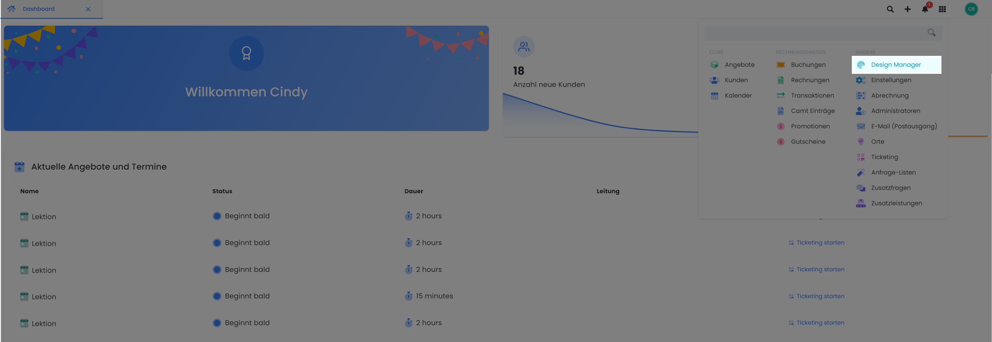
The Design Manager is located in the main navigation within the App Menu.
Tip: View Applied Adjustments Instantly
To directly verify your adjustments within the Design Manager, first select a specific offering and navigate to «Preview – Share» to open the standard view. Subsequently, launch the Design Manager. In your browser, you can then seamlessly switch between the browser tab, the preview, and the Design Manager. To display the most current version in the preview, utilize the refresh button (or press the F5 function key).
Once you've opened Design Manager, you'll have access to the tool's main features: the design itself, the templates , and the widgets.
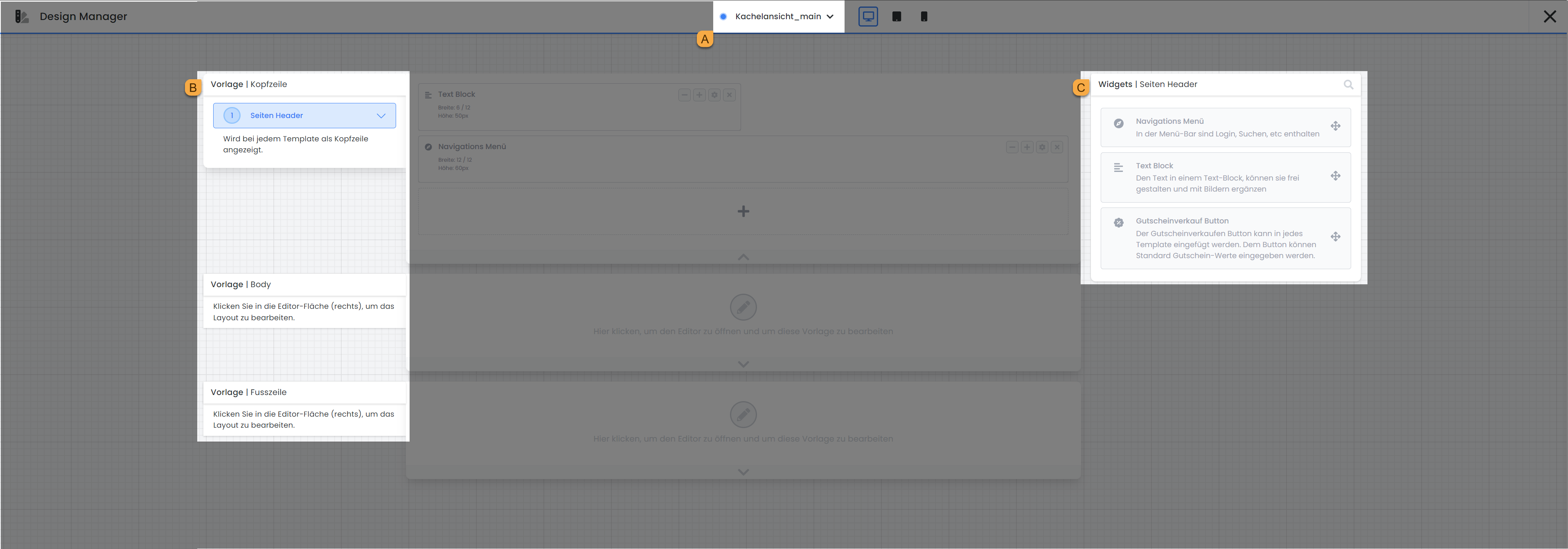
The templates are categorized into Header, Body, and Footer sections. Templates within the «Body» section delineate the booking process that a user making a reservation navigates through. Each time a different template is selected, the array of available widgets on the right side dynamically adjusts, as each template incorporates distinct widgets.
Create a New Design
The edoobox Start Design is immutable and is suitable for all bookings with standard requirements. If you have distinct needs and wish to customize the booking process, we recommend creating a new design.
To create a new design, click "+ Add Design ." The new design is always a copy of an existing design. Give the copy a new name and select the design you want to copy. You can set the design you’ve created as the default for all offers or assign it specifically to a certain category. Mark the most frequently used design by checking the box next to “Set as default design.”
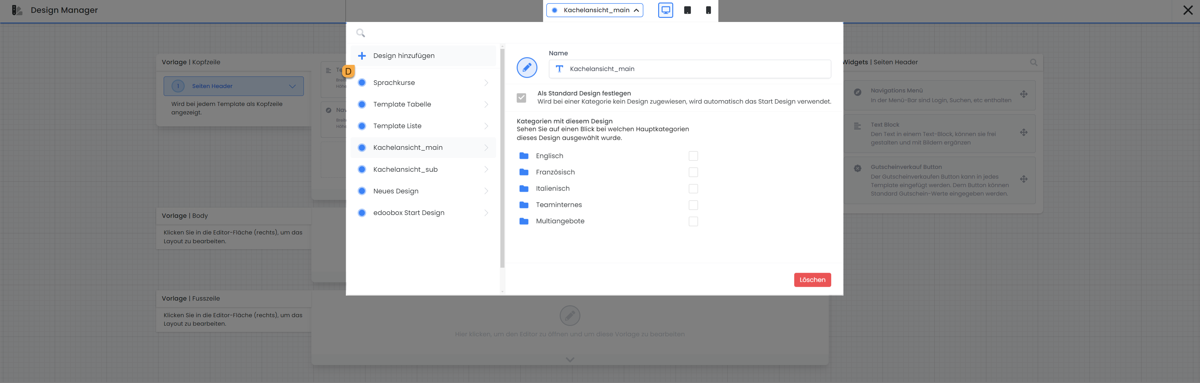
Categories with this Design
Each design can be assigned to various categories. Select here the categories for which the currently open design can be used.
Design for Different Output Devices
Within the Design Manager, you have the option to customize templates for various devices such as computers, tablets, and smartphones. The iFrame automatically selects the appropriate display based on screen size. In the smartphone view, less critical widgets can be omitted.
The iFrame in the edoobox Start Design is fully responsive and adapts to the width of the output device.
Booking Flow (Booking Process using Templates)
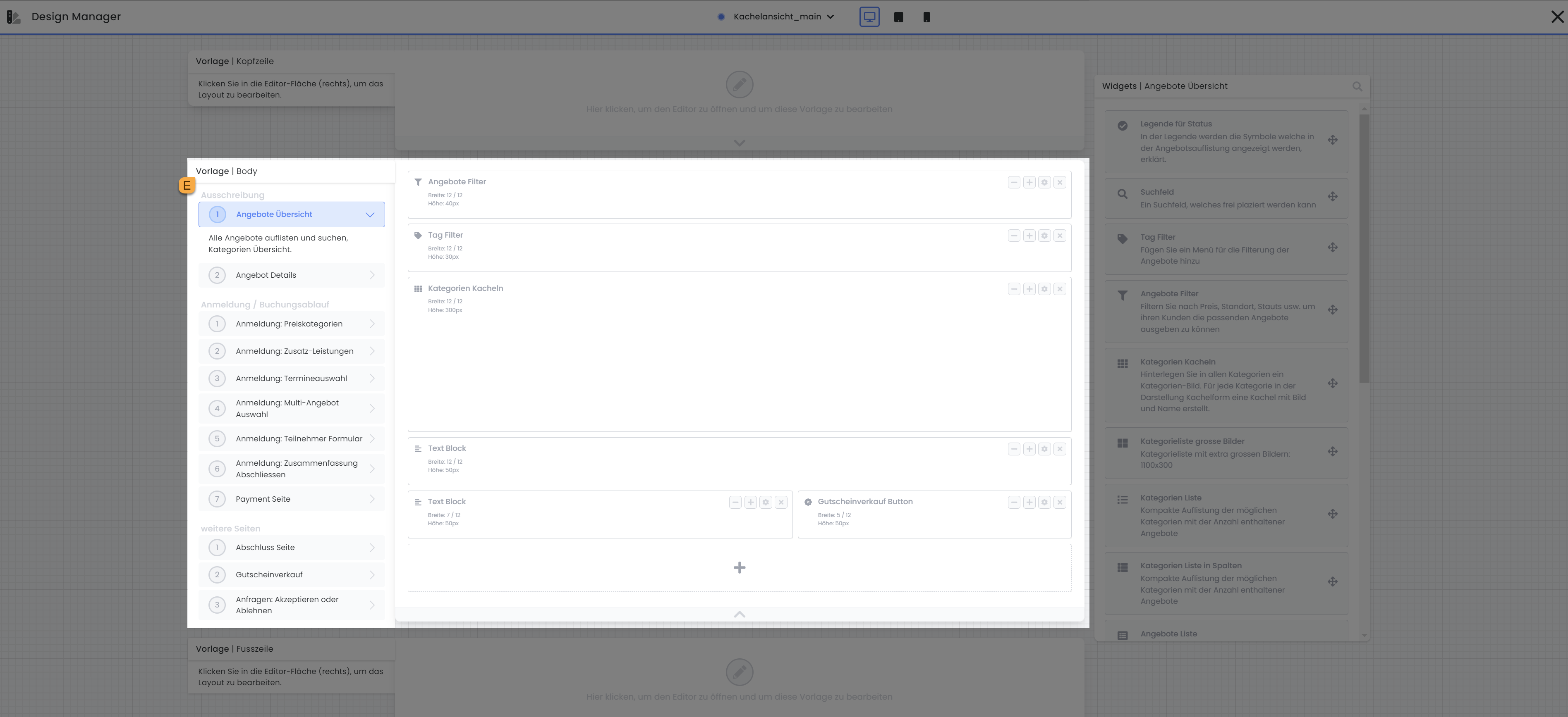
There is a separate template for each step in the booking flow—from the offer overview to registration and payment, all the way to the summary—and each can be customized. To access the templates available in the Body section, simply click on “Template | Body” E. All templates available in the Body section will then be displayed below. Then select the template you want to edit. The selected template will be displayed in the center of the screen for editing.
Widget Arrangement
Once a template is selected, the specific widgets for each template appear in the right-hand column. You can add new widgets to the workspace using drag-and-drop. You can also adjust the position of the widgets within the workspace using drag-and-drop. Use the plus (+) and minus (-) icons to increase or decrease the width of each widget. Depending on the widget type, additional customization options are available. You can access these settings either by double-clicking the widget or by clicking the gear icon. To remove a widget from your design, use the cross icon (x).
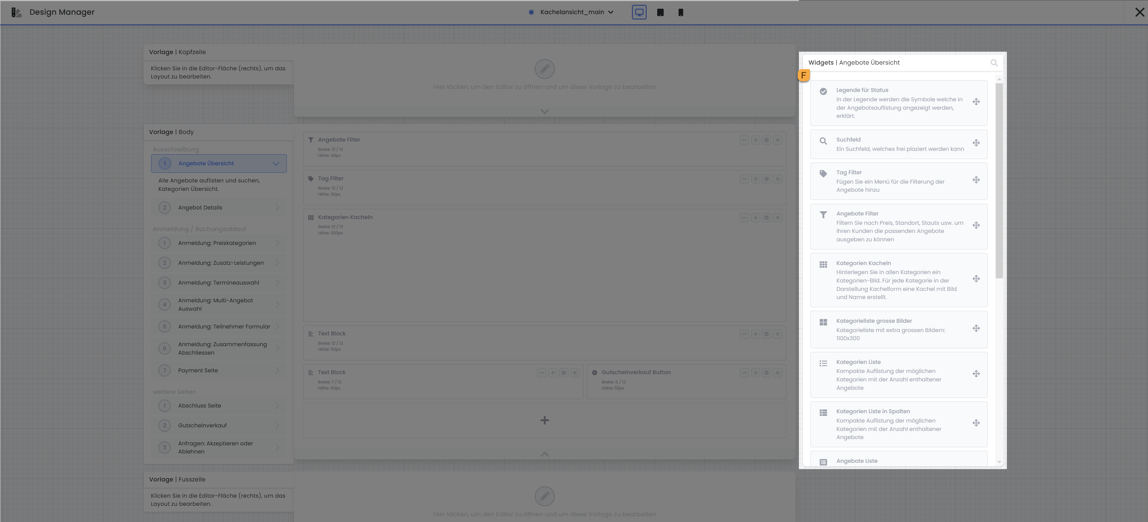
Tip: Creating a Tile View
You can initially present offer categories with images (tile view) to your visitors, allowing them to select categories and display only specific offers within the chosen category. Currently, only the guide for Version 1 is available. Guide to setting up the tile view in the Design Manager
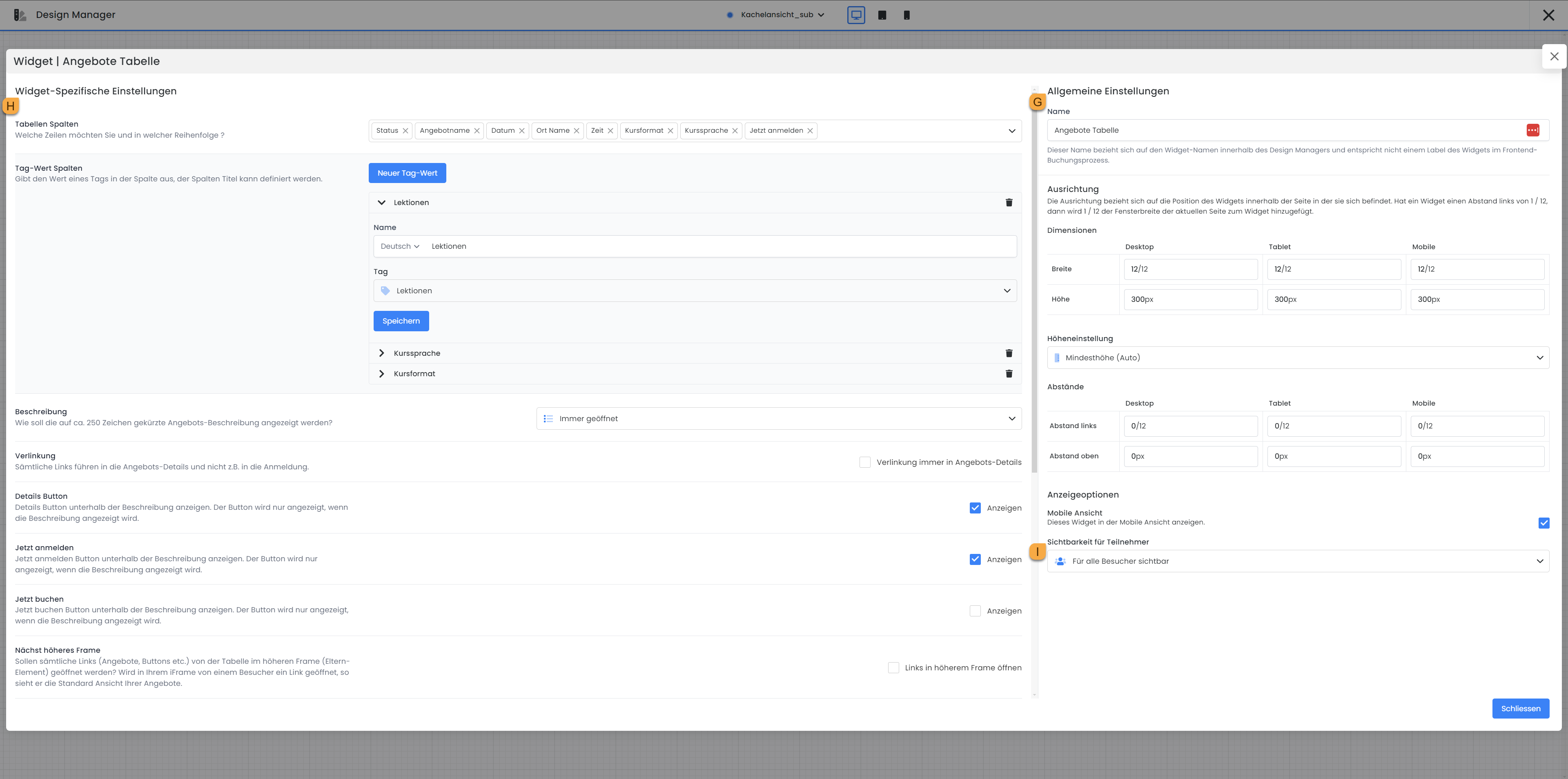
Widget Settings
As previously explained, settings for all widgets can be accessed, though not all widgets offer the same number of configuration options. Settings applicable to all widgets include the «General Settings» G for alignment, height adjustment, and display options, all located on the right side of the window. The «Widget-Specific Settings» H are found on the left side of the window. If specific data is available for selection within a widget, its order can also be adjusted via drag-and-drop.
Note: Display Options
In all widget settings, you will find the "Visibility for participants " setting at the very bottom of the right-hand column, where you can specify whether the widget should be visible to all visitors, only to logged-in visitors, or only to registered participants in this offering.
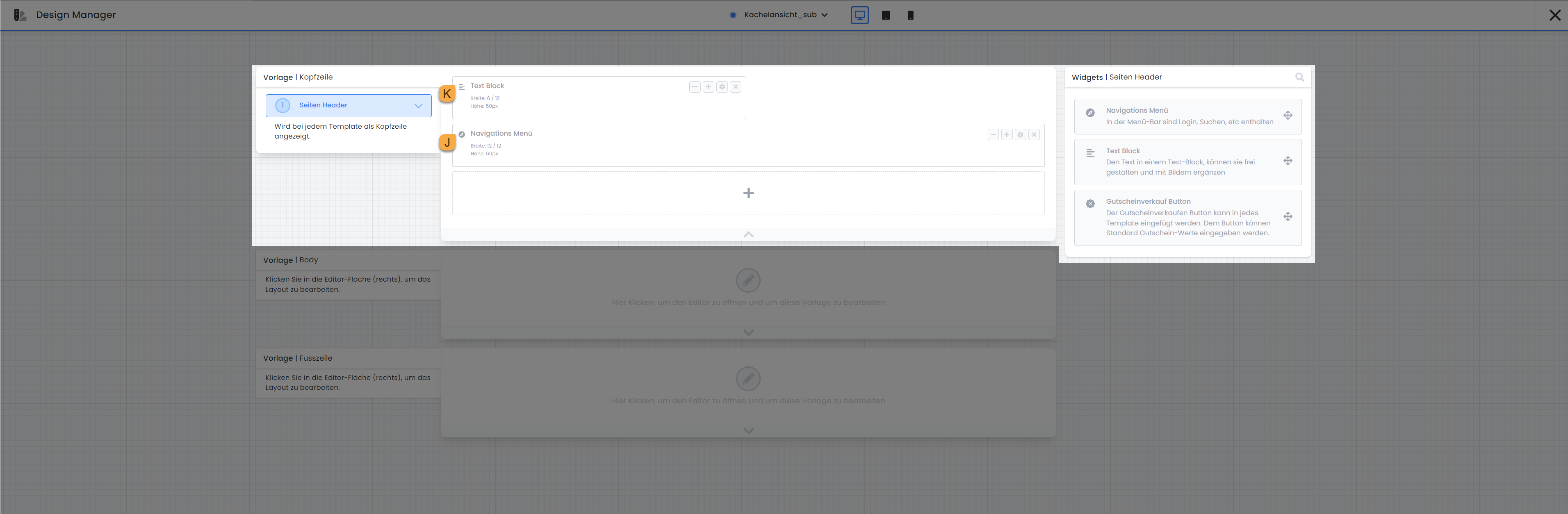
Header / Footer
Only one template is available for both the header and the footer. These two templates consistently appear in the header and footer of all other templates, respectively, and are thus intended for static information that should be present throughout the entire booking process.
For instance, the header offers the option to insert the «Navigation Menu» J widget. Within this widget, you can, among other things, determine whether booking individuals can change the language of the booking page or log into their participant account. The header is also ideally suited for adding your company logo, which will then be displayed consistently throughout the entire booking process. To do this, insert the «Text Block» K widget into the template. An editor is available within this widget, allowing you to compose text and upload images.
If you possess knowledge of CSS or JavaScript and wish to further customize the booking process, the «Code Widget» L in the footer is an ideal option. Within this widget, you can insert your own code to further adapt the design and behavior of the booking flow.
The «Cookie Banner» widget M is exclusively available in the footer. By integrating this widget, booking individuals have the option to accept or decline tracking cookies.
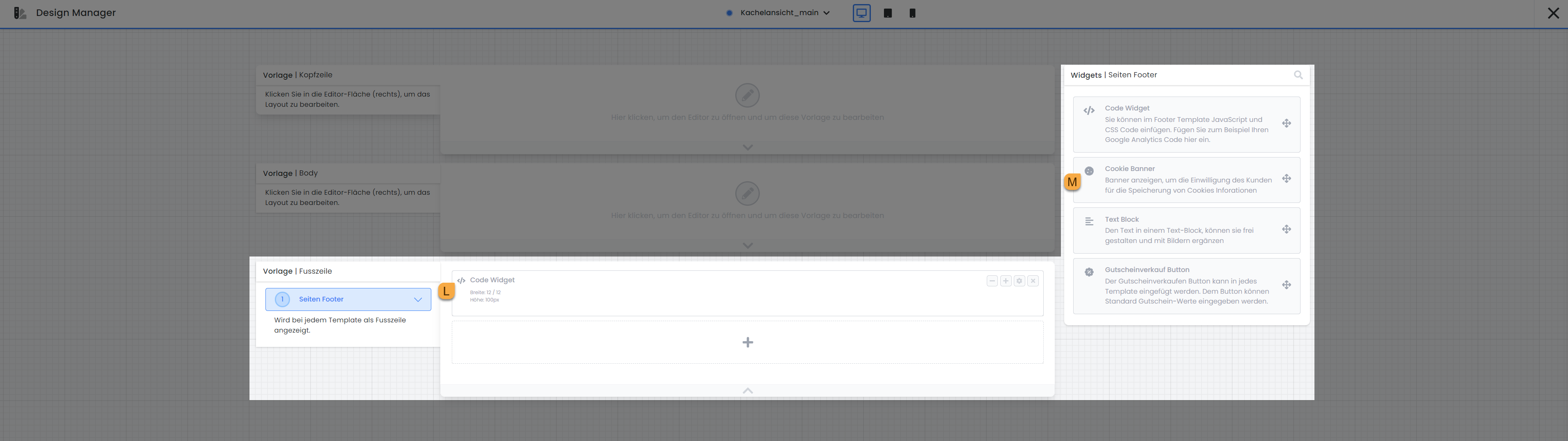
In both templates – in the header as well as in the footer – you also have the option to insert the «Voucher Sales Button» widget, which redirects users directly to the «Voucher Sales» template. The advantage of placing this button in the header or footer is that voucher sales are offered to customers on every page of the booking process, thereby increasing the visibility and accessibility of this offer.
Display design properties in the frontend
When you are logged in to edoobox as an admin and then open a front-end page, a small banner labeled "Design Properties"appears on the left side .
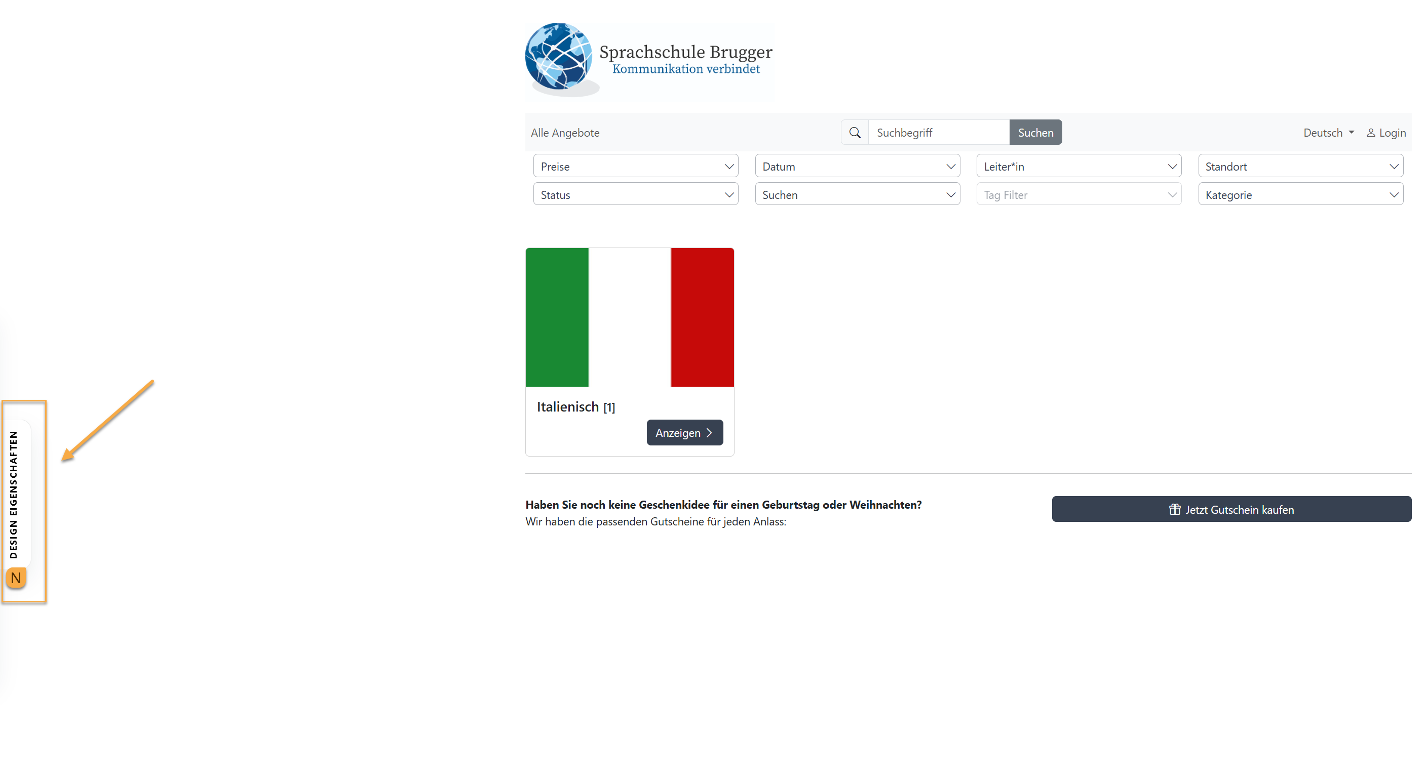
When you expand this banner, you'll see information about the front-end design currently in use. Depending on the page, the following information is displayed, among other things:
-
active design
-
Design source
-
Bootstrap version used
-
template used
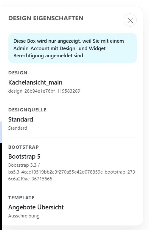
This feature is particularly helpful when making changes to the front end, as it allows you to immediately see which design template the current page is based on. This makes it easier to quickly identify which design requires changes.
Note:
This display is visible only to logged-in administrators with the appropriate design or widget permissions.
Related Guides
Keywords for this guide
Bookingflow ¦ Booking Process ¦ Cookie Banner ¦ Design Manager ¦ Code Widget ¦ Header and Footer